

While mastering color in photography can be exciting, it might add unintentional distractions in some settings, potentially diminishing the impact of the image.
Embarking on the journey of creating beautiful black and white photography, we reveal a world where stories unfold without the influence of color. I believe black-and-white imagery can showcase authentic emotion and depth, often lost in the realm of color.
Welcome to a masterclass on the beauty of black and white photography – the art of weaving vivid tales with shades of gray. Let’s unravel this seeming paradox.
In This Article You Will Learn:
- What is Black & White Photography?
- The Difference Between Monochrome and B&W Photography
- B&W Photography – From the Camera vs. Converting in Post-Production
- How to Take Black and White Photos?
- How to Decide Whether to Use Black and White?
- Perfecting the Craft: The Art of Post-Processing
- Frequently Asked Questions
What is Black & White Photography?
First, let’s start with black and white photography history: When was black and white photography invented? When did color photography came about?
The history of black and white photography is pretty rich, its roots stretching back to the very origins of photography.
In 1826, a French researcher named Joseph Nicéphore used a camera obscura and coated a plate with a sticky, tar-like substance called bitumen. He then allowed light to enter this box for a prolonged duration.
The result was a stunning creation titled ‘View from the Window at Le Gras’, which is widely accepted as the earliest instance of photography. This was also the very first black and white photo.

The first enduring color photograph didn’t emerge until 1861, three and a half decades after the introduction of monochromatic imagery.
Despite today’s dominance of color screens, black and white photography continues to be relevant and influential, having laid the foundation for photographic practices.
For example, the preference for black and white in street photography is primarily a nod to the practices of famous black and white photographers Henri Cartier-Bresson and Vivian Maier, who extensively used this medium.
Their work left a lasting impact, shaping the aesthetic choices of many modern-day photographers.
Sharpen Your Photography Skills in One Afternoon
Download my free guide with 10 expert techniques that took me years to master. You’ll discover the simple shifts that separate amateur shots from frame-worthy photos.
Join 300+ photographers already leveling up their skills
The Difference Between Monochrome and B&W Photography
“Black and white” and “monochrome” are terms that are often used interchangeably in photography, but they do have slightly different meanings:
- Black and White: A black and white image consists solely of shades of gray, ranging from black to white. It’s a type of monochrome image, but the term specifically refers to images that do not contain color.
- Monochrome: A monochrome image is composed of varying tones of a single color. In a broader sense, it refers to any image that uses only one color, but in practice, it can range from different shades of a single color to black and white or sepia tones. This is why black and white images are considered a subset of monochrome images.
In other words, all black-and-white images are monochrome, but not all monochrome images are black and white. Monochrome images could be shades of any single color. For instance, an image could be monochrome blue, with variations ranging from light blue to dark blue.

B&W Photography – From the Camera vs. Converting in Post-Production
In photography, we encounter an interesting dilemma when considering whether to shoot directly in black and white or capture the image in color and efficiently convert it into black and white. This debate goes beyond black and white vs. color photography.
At the outset, one might argue for the authenticity and aesthetic simplicity of shooting directly in black-and-white mode. It offers an immediate monochrome perspective and might help the photographer better focus on aspects like texture, form, and light, which are the essence of creating aesthetic black-and-white photography.
However, by adopting this method, one sacrifices the opportunity to utilize the rich information captured in color photographs. This may not seem important at first glance, but the significance becomes apparent when you delve into post-production.
Capturing images in color allows you to store a treasure trove of data within each pixel, resulting in the best black and white photography. This additional information can be harnessed to manipulate the image in post-production processes better.
Consider this: you capture a scene where the sky is blue. In a monochrome rendering, you might want this sky to appear darker for a dramatic effect. If your original photograph was in color, you could target and adjust the tonal values of this ‘blue’ in post-production, achieving the desired effect. This level of control is forfeited if the image was initially captured in black and white.

Moreover, shooting in color gives you a safety net for revisiting your decisions. If you photograph in black and white, there’s no going back – the color data is lost forever. However, by shooting in color, you can always re-explore the image’s potential in its original full-color form or make different adjustments to the black-and-white conversion process.
How to Take Black and White Photos?
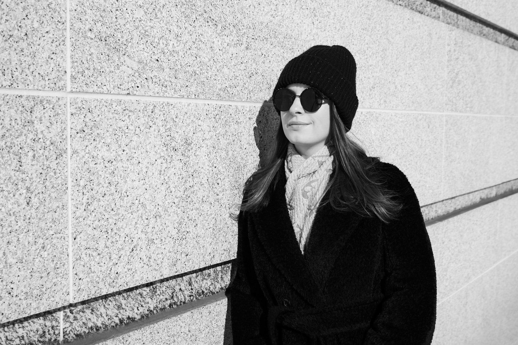
In black and white photography, the artistry lies in communicating a scene’s depth, texture, and emotion, much like the legendary Ansel Adams (the most famous black and white photographer), without the assistance of color.
To produce captivating monochrome photographs, there are a few crucial elements one must master:
Shadows
In B&W photography, ‘shadow’ ascends from being a mere darker portion of an image to becoming a potent compositional player and even sometimes the subject itself. The nuances of shadow in black&white photography interact profoundly with every facet of how a photograph is perceived.

How you interpret shadows can dramatically shape the mood and narrative of the image. For instance, shadows devoid of details, resulting in pure black areas, can evoke a sense of deep intensity.
In contrast, shadows that maintain some level of detail or gradation, rendering a softer and more complex texture, may contribute to a sense of depth, subtleness, and richness in your photograph.
Your strategy for using shadow should align with what you believe best represents your subject and personal photography style.
Contrast
The contrast in photography is misconceived as simply the divergence between the lightest and darkest areas within an image. However, this is a rather surface-level interpretation.

If we were to consider a gradient transitioning from white to black, it technically exhibits ‘extreme contrast’ since it encompasses both extremes of the tonal scale, yet it does not possess the dramatic effect usually associated with high contrast.
Spatial proximity is often overlooked when discussing contrast – the visual tension created when areas of disparate brightness are juxtaposed.
In black and white photography, contrast serves not just as a visual tool but as a conveyor of emotive narrative. High-contrast images, characterized by bright highlights juxtaposed against deep shadows, emanate an aura of energy, drama, and dynamism.

However, the allure of contrast does not negate the value of low-contrast images. With their muted tones and subtle gradations, such photographs exude a serene, ethereal quality.
A soft grey-ish portrait may lose its tranquillity if depicted in harsh contrast, distracting from its inherent serenity. Conversely, a grand B&W landscape may demand high contrast to accentuate its awe-inspiring features and convey its commanding presence.
Tones
Tones essentially constitute the backbone of black and white photography, defining the visual and expressive depth of the image. When photographers refer to a picture as ‘high-key’ or ‘low-key,’ they highlight an extreme manipulation of tonal values in the photograph.
While most photographs tend to inhabit the middle ground, balancing both dark and light tones, it’s still essential to pay heed to the tonal composition of your image. Like contrast, tones can subtly dictate the photograph’s mood.
Texture
From the smooth facade of a glass building to the craggy surface of an ancient wall or the rippled sands of a desert to the silken touch of a spider’s web, texture fundamentally shapes the character of an image – and it’s even more noticeable when you mute other elements, such as color.

Shapes
The absence of color in black&white photography amplifies the significance of shapes in the frame, transforming them into integral storytellers within your composition.
Picture a cat silhouette against a plain white background in a monochrome photograph. The image, devoid of tonal variations, shadows, or textures, still unequivocally communicates that the subject is a cat.
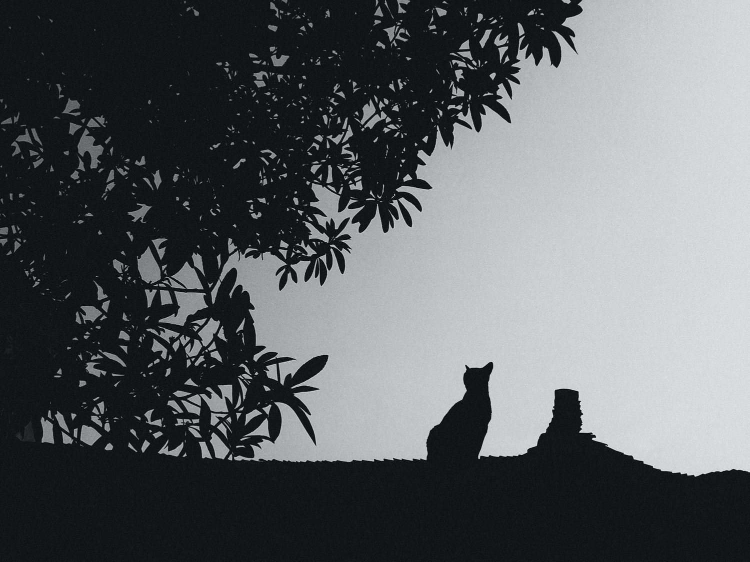
In black-and-white photography, where color is absent, the importance of shapes is magnified. They act as a visual guide, helping the viewer to interpret and connect with the photograph. In this context, shapes become more than mere forms.
Composition
Composition in black-and-white shots is vital, just like with color. The image is not merely a haphazard capture, but it holds a well-defined structure and organization.
I’ve covered composition in the past, especially in portrait shots. But it’s important to reiterate that elements of your photo will be perceived differently in black and white compared to color. On occasion, the inherently abstract nature of B&W photography can be employed to amplify the intrigue in your frame.
So while composition makes a difference in just about any case, black and white photography will highlight it most clearly. That’s because there’s one less thing to focus on (color).
How to Decide Whether to Use Black and White?
Here are some factors to consider:
- Emotion: Black-and-white can evoke different emotions than color, often intensifying the perceived emotional content of a scene. It’s often used to convey feelings of nostalgia, timelessness, or drama.
- Subject Matter: Some subjects lend themselves well to black-and-white, like architectural photos where you can emphasize shapes and lines, or portraits where the focus can be shifted to expressions and textures.
- Contrast: Black-and-white can highlight contrast and texture in an image that might be lost in a color photo.
- Distraction: Color can sometimes distract from the main subjects or the photo’s composition. Converting an image to black-and-white can help simplify the image and focus attention on the desired subject or element.
- Artistic Vision: Ultimately, the choice between color and black and white should align with the photographer’s creative vision for the image.
Perfecting the Craft: The Art of Post-Processing
In the black-and-white world, clicking the shutter merely scratches the surface of your image’s potential. The real magic happens during post-processing, where your image truly transforms.
How to Make an Image B&W in Lightroom
1. BASIC PANEL METHOD:
Open your image in Lightroom and go to the ‘Develop’ module.
You’ll see an option named ‘Treatment’ in the’ Basic’ panel. Click on ‘Black & White’.

This will convert your image to black and white, but you may want to adjust the contrast and brightness of the image for a more refined look. You can do this using the ‘Tone’ section of the Basic Panel.
2. B&W MIX PANEL METHOD:
- Open your image and go to the ‘Develop’ module.
- Select ‘B&W’ in the ‘Treatment’ section of the ‘Basic’ panel.
- Then, scroll down to the ‘B&W’ panel (it replaces the ‘HSL/Color’ panel when you switch to ‘B&W’).

Here, you can adjust the grey tones of each color in your image. Drag the sliders to the left to darken the greys for that color and to the right to lighten them.
Advanced post-processing techniques for portraits in Lightroom:
Frequently Asked Questions About Black and White Photography
Black and white photography is also known as monochrome photography – because it is essentially a subtype of monochrome photography. The terms are used interchangeably.
All colors in black and white photography can look good, but their contrast matters most. Colors on opposite ends of the spectrum (such as red and green or blue and yellow) often create the most impactful contrasts. Remember that other elements matter in making a B&W photo good.
Black and white photography started with the invention of the daguerreotype process by Louis Daguerre, introduced to the public in 1839.
Consider making your photos black and white to emphasize textures, shapes, and forms or to create a timeless, classic feel. It’s also a good choice when the color distracts from the subject or mood of the photo or takes away from the emotion in your photograph.
How To Take Beautiful Black and White Photos: Final Words
You can convert any photo into B&W, but not every image will tell a compelling story in black and white.
Like transforming a caterpillar into a butterfly, not every photo is destined to metamorphose into beautiful black and white photography.
However, as we’ve seen, a world devoid of color isn’t devoid of vitality.
Photography is an art of observation, and practicing black and white photography refines this skill.
Go ahead, pick up your camera, and come up with black and white photography ideas. And if you need a push, scroll through out other resources here on OhMyCamera.
Further reading:
- From Good to Great: Lightroom Color Grading for Portrait Photos
- Embrace the Shadow: How to Take Portraits in Harsh Sunlight
- From Sunrise to Sunset: Natural Light Portrait Photography Guide
- Photography Projects: Staying Inspired and Motivated
- Portrait Retouching: Enhancing Your Subjects in Post-Processing